Adding authority and sophistication to Lemdell, Sydney’s premier Fruit and Vegetable wholesaler.
Branding • print • packaging • 2025
-
Lemdell
-
Jamie Henshall, Creative Director
Mike McCammon, Graphic & Web Designer
Sandy, Designer
Jake Cootes & Nicole Maloney, Photography
-
Brand Identity
Website Design
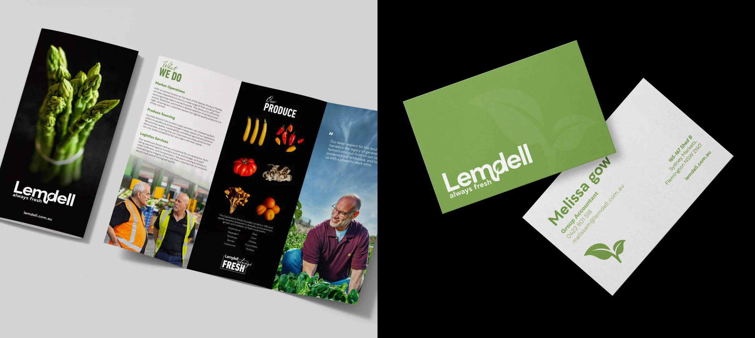
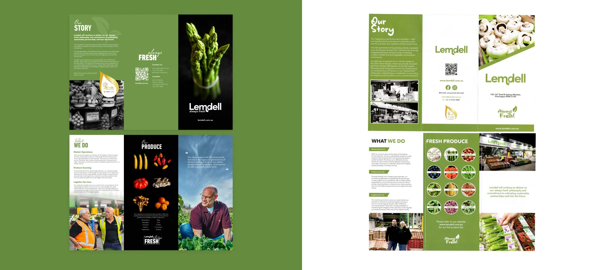
A4 Corporate Profile
A4 Trifold Flyer
Micro-brand
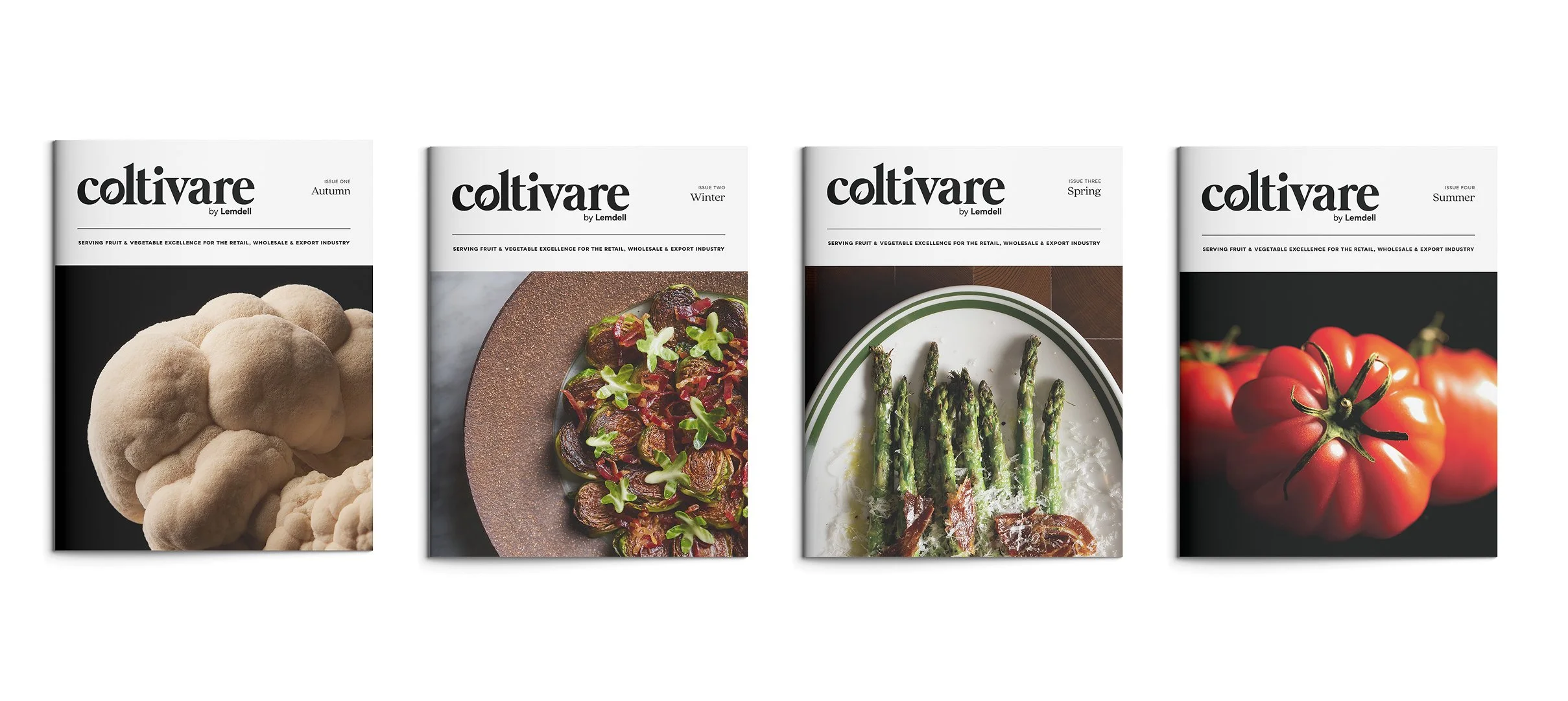
Quarterly Magazine
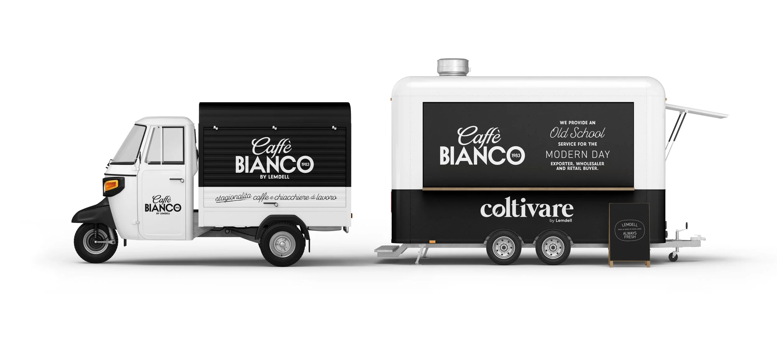
Coffee Cart Design
-
2025
Lemdell needed a refreshed brand that felt modern while honouring over 30 years in the mushroom industry, a legacy begun by the founder after immigrating from Italy. I worked across packaging, brand stationery, guidelines, and a redesigned website that highlighted both heritage and innovation.
Whitepapers were updated to reflect a more professional voice, and alongside the creative director, I helped conceptualise a new marketing pillar: Coltivare Magazine. What began as ideas for a coffee cart activation with a branded newspaper evolved into a quarterly magazine celebrating Sydney’s mushroom legends, complete with a new logo and visual identity. And we kept the coffee cart.
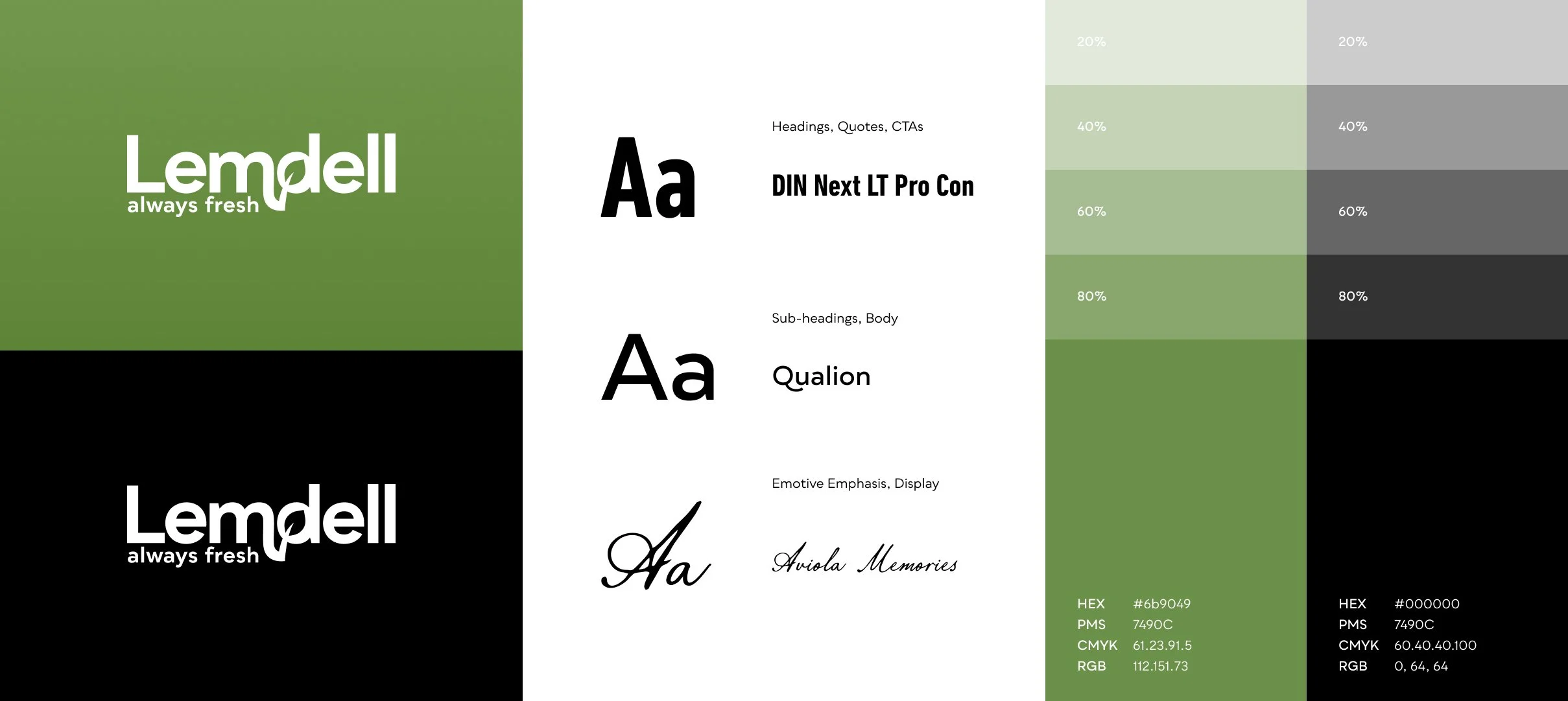

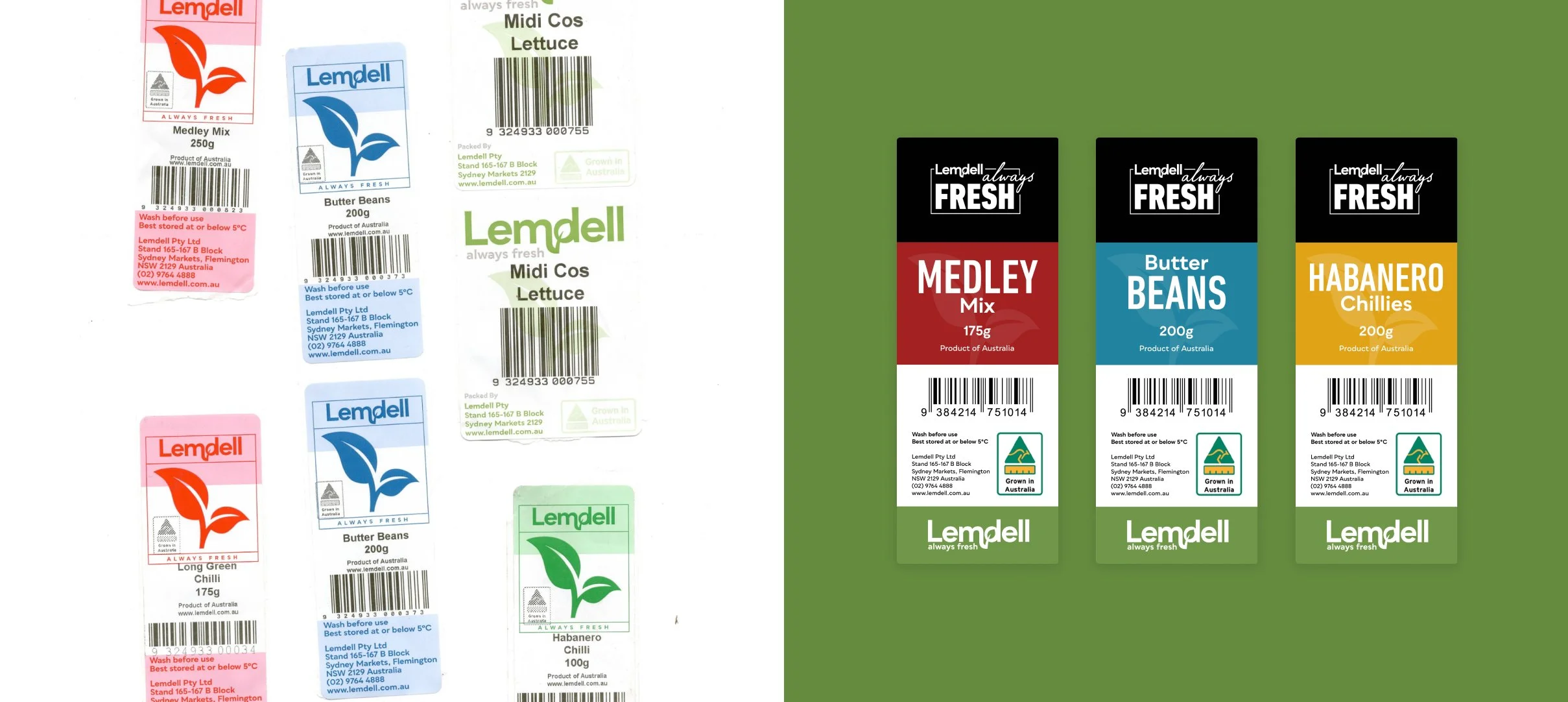
We simplified the logo by removing the secondary colour palette, which felt confusing, including the dated brown, and stripped back the palette to let product photography and content take focus. Incorporating deep black across branding and imagery added a sense of legacy and premium quality. The core modern sans-serif typeface was retained, complemented by a bold condensed font and Viola Memoires to honour Lemdell’s 30-year Italian heritage.
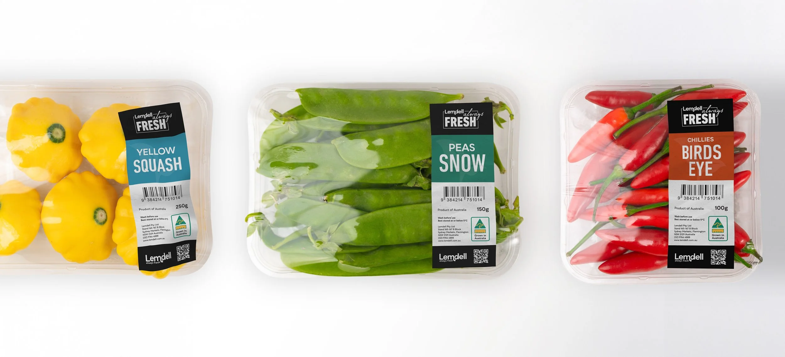
For the whitepapers and labels, we continued the simplification trend by creating clean, sectional layouts that used Lemdell green as a visual divider. The retail label system was completely refreshed, with increased colour saturation for each fruit and vegetable range to make them more eye-catching on shelves while also improving readability and ensuring they were cohesive with the brand.
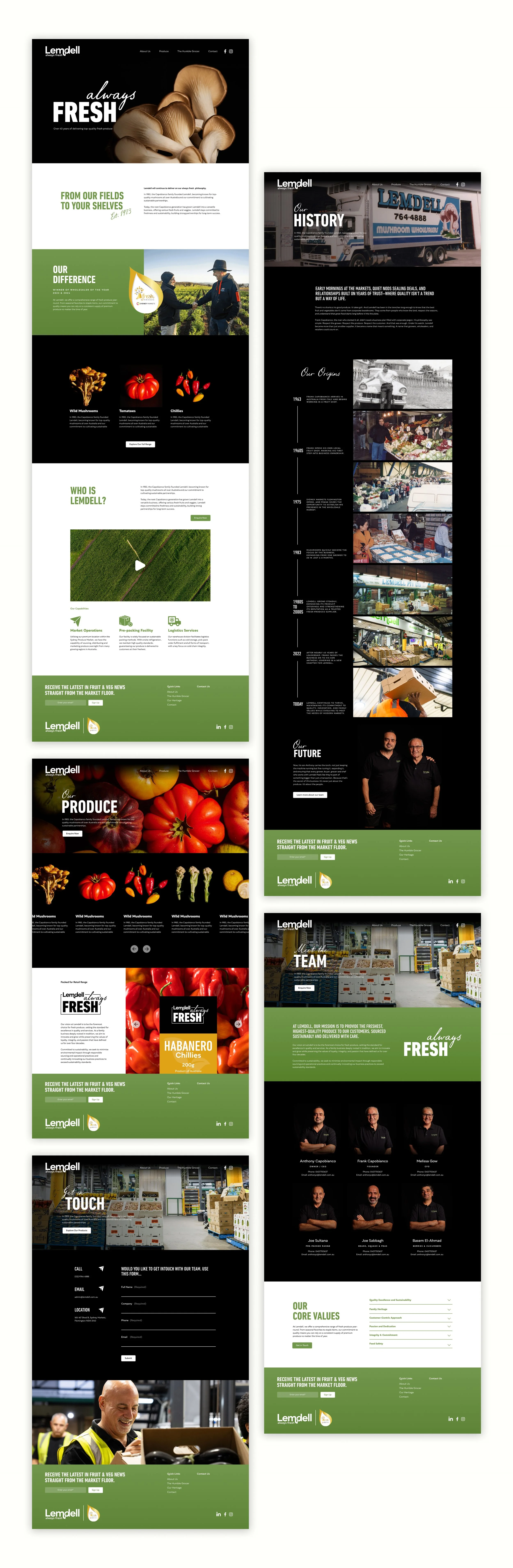
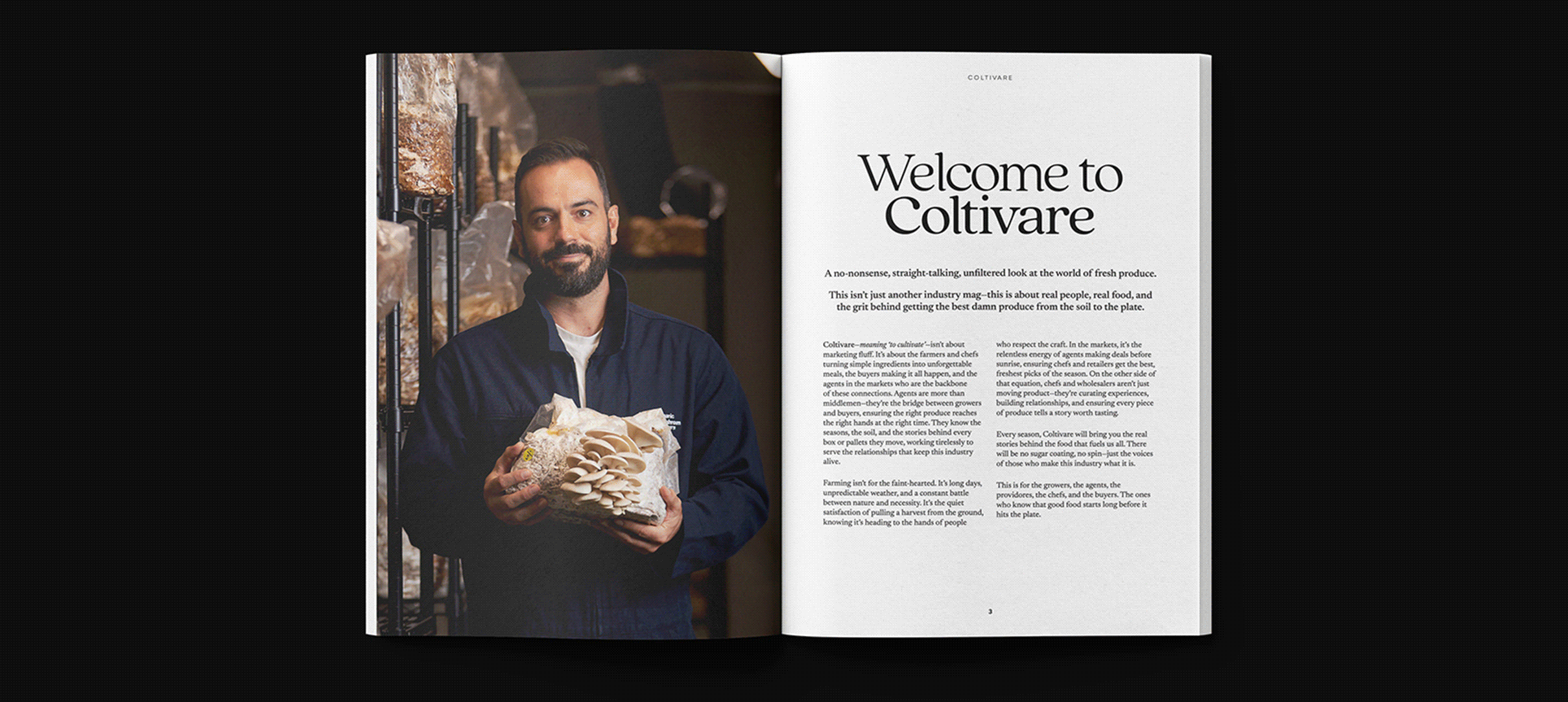
Working closely with the creative director, I helped conceptualise a new marketing pillar that became Coltivare. Each issue features a story from Lemdell, a grower, a chef, and seasonal recipes that bring Lemdell’s produce to life.
To make the launch memorable, Lemdell paired the magazine with a vintage Italian-style coffee cart activation, supported by a nostalgic design direction using textured fonts and sectional layouts (working well with our new brand direction) that nod to the brand’s heritage.
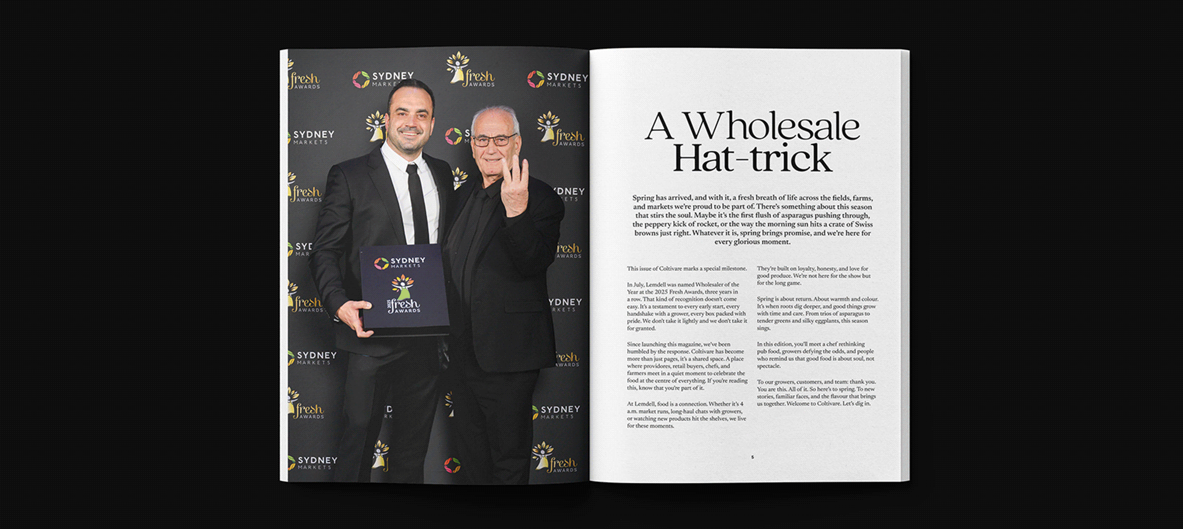
As typesetter and designer (and occasional photographer) for the magazine, I developed a consistent grid, type hierarchy, and layout system for clarity and readability, while intentionally breaking these rules in featured articles to give every issue its own distinct personality. Now three issues in, Coltivare has become a cornerstone of Lemdell’s marketing, connecting the brand with its community in a fresh and engaging way.